MULTI-TIME FRAME ANALYSIS
With multiple- time frame analysis, we analyze a currency pair to trade looking at different time frames.
To do that, you start with the larger time frame to the medium time frame then to a lower time frame.
In other wards, you simply compare price movements of the same currency pair on different time frames.
For example;
If we are to trade a setup on a daily chart, we shall use a weekly chart as our larger time frame and H4 chart as a lower time frame for our analysis.
Trading in the direction of the longer trend increases your chances of entering trades with a higher probability of success. As a matter of fact a trader aims at increasing more odds/chances to his side as well as the winning rate/success of the trade.
So, as you try to analyze the market behavior, it is important to wait to enter until the smaller time frame is in agreement with the larger time frame.
Let’s have a look at an example below.
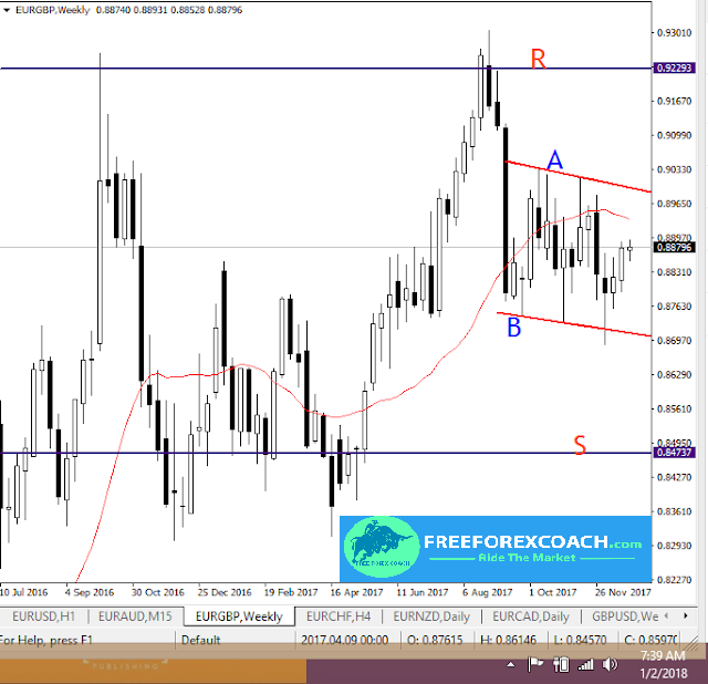
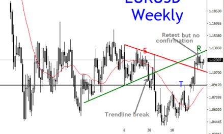
HOW PRICE REACTED ON A WEEKLY CHART
The price reacted so fast with rapid selling after hitting resistance R zone.
Currently price is in a channel congestion marked by the red trend lines A and B. This means we keep trading within the channel until we see a convincing break of the channel..
A break and close of weekly candle above A, may lead price to retest the previous resistance zone R around 0.92293.
Break close of weekly candle price below trend line B, may lead price to the previous strong support zone marked S around 0.84737.
The immediate reaction off the resistance zone, implies a strong bearish bias. This bias will be maintained if price in the channel keeps below the 21 Simple Moving Average in the chart above.
But since anything can happen in the markets, keep the trading within in the channel and wait for price confirmation on the channel break either way.
Let’s look at the channel clearly on the daily time frame:
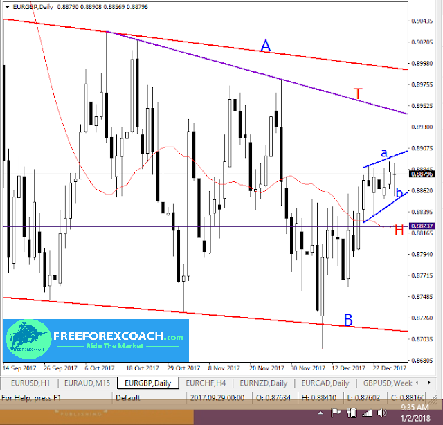
HOW PRICE REACTED ON A DAILY TIME FRAME CHART
On the daily chart, we can clearly see the price action in the channel. The red trendlines A and B are same as those on the weekly chart.
So what we are seeing on the daily chart is price in a small channel too marked by blue trendlines a and b.
A break and close of daily candle above blue trend line a, may lead price to retest the immediate resistance marked by purple trend line T.
Strong close above T can lead price high above into the ultimate weekly trend line resistance A.
Meanwhile, a close of daily candle below blue trend line b, may lead price to retest the immediate support zone marked by purple trend line H.
The H zone is the same as the 21 Simple moving average zone, this makes it quite a strong support zone.
A strong close below H can lead price into the strong weekly support zone marked by red trendline B.
Daily chart congestion indicates keeping lower time frame trading on 4-hourly or hourly in the small daily channel marked by blue trend lines a and b, until we get a daily candle close above/below the channel.
From the above illustrations, we can clearly tell that multiple-time frame analysis is very important if you are to trade profitably. The lower time frame gave us confirmation for our entry point as the higher time frame was used to identify the strong support and resistance levels marked on the chart by the channel.


