
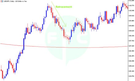
In this article will see how the 3 moving averages are reacting to the current price action. In our previous Gold analysis, we critically analysed the footprints of the big guys especially on the daily and lower time frames. We had great short trade rides after confirmation. Now let us look how the moving averages are responding to the price movement!
We shall start with the Weekly chart below;
GOLD Weekly chart with Moving Averages
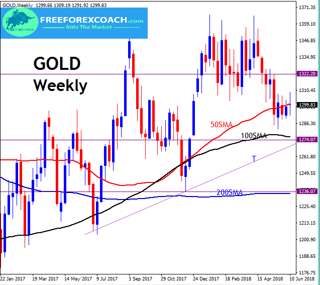
On the weekly Gold Chart above, we having almost all the moving averages flattening out. This is a great sign of indecision in the price movement. You can clearly see this as price congests within a small price channel ranging between 1306 and 1284.
This congestion is further clearly noticed by the 50 Simple Moving Average running through the price. But from the arrangement of the of the of the moving averages on the chart, it still shows in a uptrend until we witness any crossovers to confirm trend change.
From our chart above, the black 100 Simple Moving Average is getting close to the price too, so we may see a fall in price into the 100 Simple Moving Average support zone. This is the same zone as the trend line T support zone from our previous article. Preferably we will watch for a confirmation on the daily chart that we shall discuss later below.
A candle close below the 100 Simple Moving Average confirmed by a weekly candle close below the support trend line T zone may lead price into the 200 Simple Moving Average ultimate support. This will the 1240 – 1236 previous lows support zone.
On the hand, if we get a weekly bullish candle closing 1310 resistance zone, we may have price aim for higher levels around 1322 and then 1335 resistance zone.
Trendline T support zone remains a critical area for trend change confirmed by moving averages crossovers
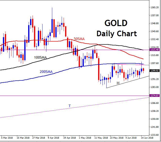
Now let us look at the Daily time-frame.
GOLD Daily chart with Moving Averages
The daily chart clearly shows what is happening within that small congestion on the Weekly chart.
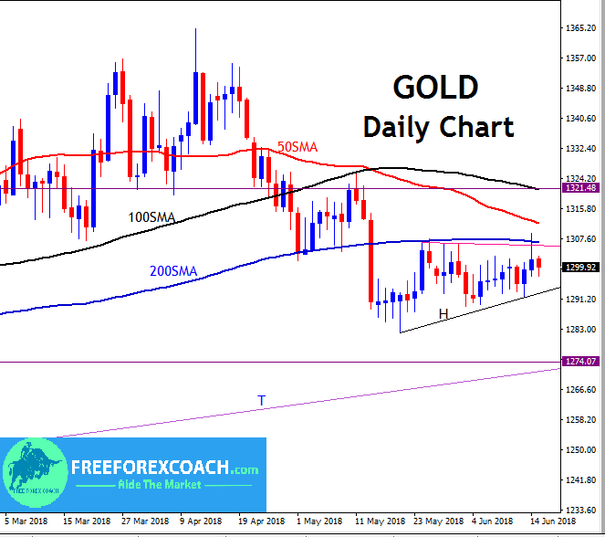
From the chart above, we having the moving averages getting close to each other (congesting) as price congests too. Price is below all the moving averages although we have not yet had a total crossover of all the moving averages to confirm the downtrend.
We had crossover on just last month on the 14th of May with some downside push, same time as when price broke through the 200 Simple Moving Average. Currently we have a congestion on the daily time which has lasted a month now. This congestion began on the 16th of last month.
But the most important fact to observe is how price has kept congesting below the 200 Simple Moving Average after the break. This kind of movement shows a bearish bias until we have a bullish daily candle close above the 200 Simple Moving Average.
A daily candle close below the small black trend line H confirmed by the moving averages cross overs is likely to push price into 1274 support zone.
1274 support zone is the same as the trend line support zone T from our previous analysis and also same as that shown on the weekly chart above. This is the same zone as the 100 Simple moving average support zone on our weekly chart above.
Like we mentioned above, weekly candle close below the Trendline T support zone is likely to lead price into the weekly 200 simple Moving average support zone as shown on our weekly chart. If this happens, we shall have all the daily moving averages crossed over already confirming downside trend.
On the other hand, from our daily chart, a daily candle close above the 200 simple Moving average from our current congestion, may lead price to retest the 1320 resistance zone. This 1320 zone is the same as the 100 Simple Moving Average resistance zone.
Keep up the watch and wait for confirmations!
Happy Trading!

